แปลสรุปข่าวโดย นางสาวภัทรานิษฐ์ ชัยศร
รหัสประจำตัวนักศึกษา 5511300328 กลุ่มเรียน 101 เลขที่ 1
Email :ิ phatranit.c@chandra.ac.th
Blogger : http://artd2307phatranittt.blogspot.com/
รายงานวิชา ARTD2307 การออกแบบอัตลักษณ์
http://www.fable.sg/chen-nguyen/
https://sg.linkedin.com/in/hellofable
http://culturepush.com/2012/10/11/spotted-jiahui-tan/
https://sg.linkedin.com/in/hellofable
http://culturepush.com/2012/10/11/spotted-jiahui-tan/
Design Director : Jiahui Tan
Chen Nguyen
Posted on January 28, 2016
Contributed by Jiahui Tan of Singapore-based Fable.

Summary
Fable is a creative consultancy based in the Republic of Singapore.
Specialties: Identity/Branding, Brand Strategy, Art Direction, Graphic Design, Digital Design, Idea Development
สรุป
นิทานเป็นที่ปรึกษาความคิดสร้างสรรค์อยู่ในสาธารณรัฐสิงคโปร์
ความถนัด : อัตลักษณ์ / กลยุทธ์การสร้างแบรนด์, กำกับศิลป์, กราฟิกดีไซน์ ออกแบบระบบดิจิตอล, การพัฒนาความคิด
Chen Nguyen
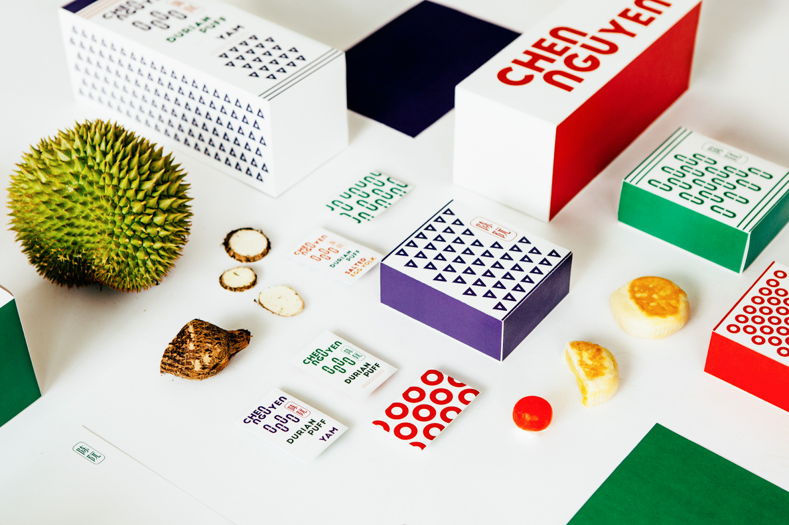
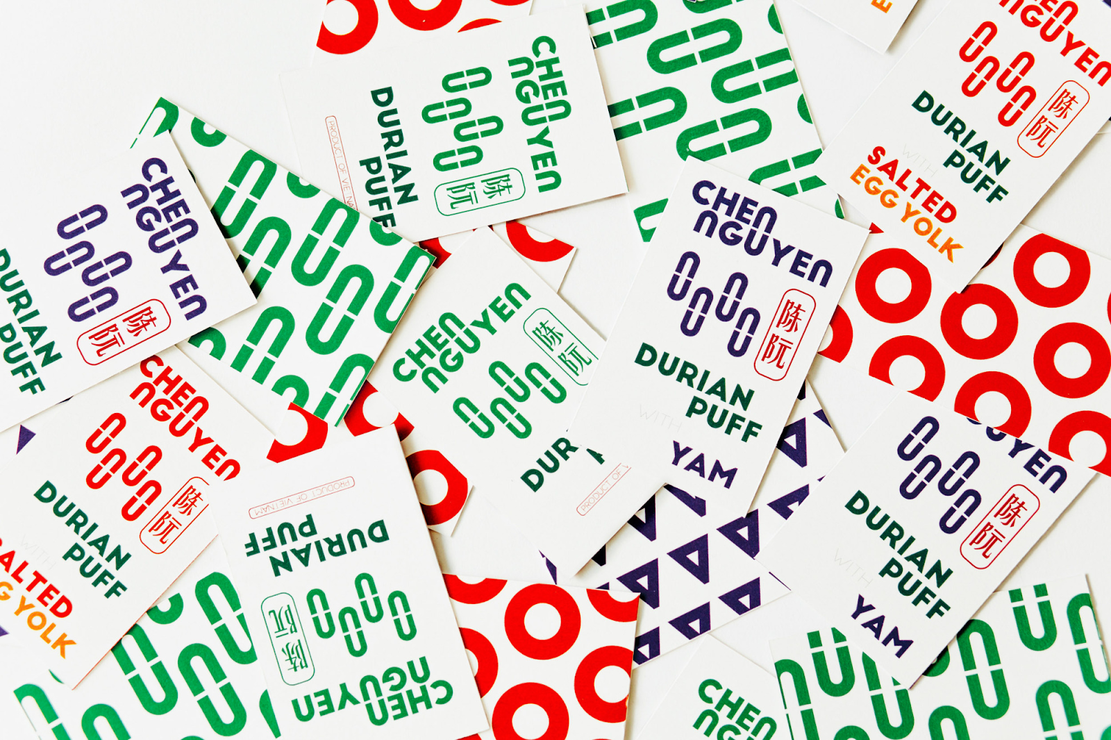
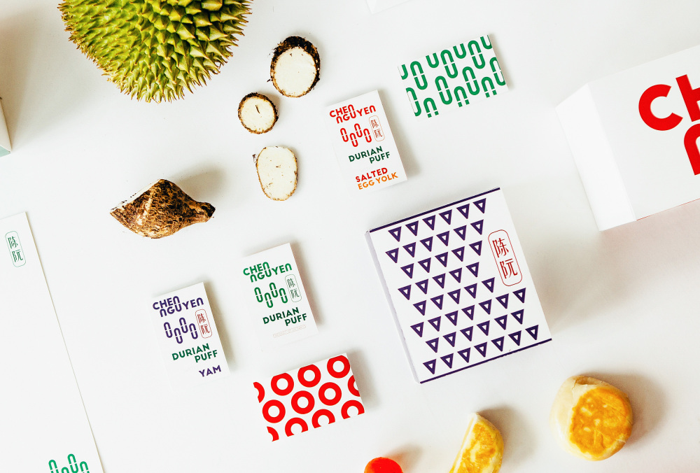
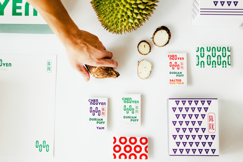
We were commissioned to design the brand identity and packaging for a durian pastry manufacturer and distributor in Vietnam.
The design primarily utilises two key design elements – shape and colour – to be integrated seamlessly into the overall visual construct. To be primarily produced and distributed in Vietnam and China, these shapes and colours have to be easily identifiable and distinctive. The visual elements are used to highlight and distinguish the different origins of each flavour.

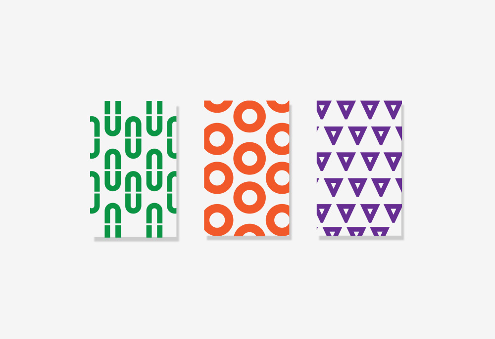
Shape
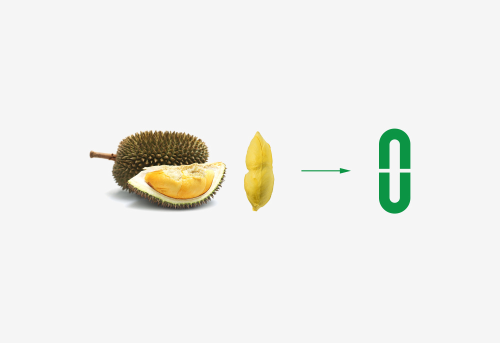
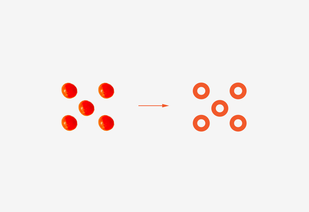
Using elements inherent in the logo type, the alphabets ‘n’ and ‘u’ are creatively merged to form basic shapes – an oval for durian, a circle for salted egg, and a triangle for yam. This draws inspiration from well-known characteristics of each flavour, with the oval representing the durian seed, and the circle representing the full yolk found in salted eggs, for example.
Colour
Each flavour will also have a unique colour scheme – green for durian, orange for salted egg, and purple for yam. These colours are common hues associated with the respective flavours and their key ingredients.
แปลสรุป
เฉินเหงียน
เราได้รับหน้าที่ในการออกแบบอัตลักษณ์ของแบรนด์และบรรจุภัณฑ์สำหรับผู้ผลิตขนมทุเรียนและจัดจำหน่ายในเวียดนาม
การออกแบบส่วนใหญ่ใช้สององค์ประกอบการออกแบบที่สำคัญ - รูปร่างและสี - จะบูรณาการต่อเนื่องในการสร้างภาพโดยรวม ที่จะผลิตและจัดจำหน่ายหลักๆในประเทศเวียดนามและประเทศจีน, รูปร่างและสีเหล่านี้จะต้องมีการระบุตัวตนได้อย่างง่ายดายและโดดเด่น องค์ประกอบภาพที่ใช้ในการแยกแยะความแตกต่างเน้นและต้นกำเนิดที่แตกต่างกันของแต่ละรสชาติ
รูปร่าง
การใช้องค์ประกอบอยู่ในประเภทโลโก้ตัวอักษร 'N' และ 'U' จะถูกผสานสร้างสรรค์ในรูปแบบรูปทรงพื้นฐาน - วงรีสำหรับทุเรียน วงกลมสำหรับไข่เค็มและสามเหลี่ยมสำหรับมันเทศ ได้แรงบันดาลใจจากลักษณะที่รู้จักกันดีของแต่ละรสชาติกับวงรีที่เป็นตัวแทนของเมล็ดทุเรียนและวงกลมที่เป็นตัวแทนของไข่แดงเต็มรูปแบบที่พบในไข่เค็ม
สี
แต่ละรสชาติยังจะมีโทนสีที่ไม่ซ้ำกัน - สีเขียวสำหรับทุเรียน ส้มไข่เค็มและสีม่วงสำหรับมันเทศ สีเหล่านี้เป็นสีทั่วไปที่เกี่ยวข้องกับรสชาติที่เกี่ยวข้องและส่วนผสมที่สำคัญของพวกเขา

ไม่มีความคิดเห็น:
แสดงความคิดเห็น